In this guide I will tell you about the flat design in such a way that people who are far cry from design and illustration could learn the information easily, and people
who are live and breathe the design could get to know a lot of new things.
I will provide you with examples that will cover a topic better than any words.
Especially for beginners, the guide contains integrated video lessons with a detailed analysis
of the working process. Even if you are not familiar with the Adobe Illustrator interface,
that won’t be a problem.
06. Working with the color scheme
4/10
This is over the odds: too many colors,
a lot of shades, all flashy.
The icon looks garish.
The number
of colors
should be reduced.
Here we fill the most contrasting areas
of the shadow with the outline color.
We get rid
of two dark blue and dark red colors at a time.
The number of blue spots in the composition
is reduced. The result looks much nicer
to the eye than
the original version.
Get rid of blue, green and red.
Now there are three pure colors
in the color scheme:
yellow, red and blue.
The gray color is removed.
The volume
is stylized by using
the points of the contour color.
Now the icon has recognizable elements and colors.
A lot of examples
Learning from your own mistakes is important, but it’s even more important to save time and learn from the mistakes of others.
The idea of the guide is built around examples of what is good,
what is bad, and what is more —
how you can handle the task
in a different way.
Usable format
Webinars are terribly inconvenient format of training: there are 10 units of student’s time per 1 unit
of the meaning.
The guide is deprived of this drawback: the information
is given briefly, concisely and there is an easy navigation through
the sections.
Updated content
I am against the classical model
of online studying when you pay, download lessons, turn in the task and then take the next step.
The content of the guide is constantly updated,
so that
my students could
remain
highly-demanded on the market.
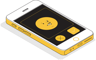
Let’s consider it by the example of the composition
of the phone
in the isometric projection.






But there is no point to be bent on working with color
only as there are other graphic techniques in our range.

Topics covered:
Style
Stylistic techniques, trends,
forms simplification, development of the unique visual language,
objects
and characters design

Volume styling
Working with light and shade,
volume simplification, design ways
of depth transfer, texture

Composition
Balance, visual weight,
working
with metaphors,
isometry, perspective

Color
Toning, colors mixing,
color schemes creation










July 30, 2018
Olga Olazhko / freelancer
I’ve heard about the guide in the blog on Medium. At the same time
I thought that I didn’t need a guide and classes because
I’m already a decent designer. In a while, I’ve decided to purchase
the guide + group classes after all, thanks to the advertising
techniques of Nikita.
That proved to be a useful and interesting experience. Illustrations are verified, information is systematized, texts are exact and there
is no superfluous information
(although I would like to read more about the character).

September 2, 2018
Kirill Semushin / Flatro
This is a juicy takeaway of useful information with cool explanatory illustrations. Jokes aside, this manual is number one for all those involved in the illustration. And it doesn’t matter what your skill is, you will definitely learn something «fresh».
There are no analogues
of this in Russian and I don’t think
they will appear. Rabbit knows what
he does. Respect!

December 13, 2017
Valentin Kitchensky / Monetizr
After the course I can confidently answer the question
«Is Mad Rabbit a knock-out?» Yes, he is! Alpha plus.
The information is a squeeze of all the most useful.
The presentation is excellent and everything is on point.
By personal example I was convinced how fast the investment
in self education pays off.
IN FLAT
Guide
Self-tuition
Today:
100 USD
Pre-order price
THE PRICE INCLUDES:
unlimited access to the guide and video lessons;
access to the private Telegram channel with additional content
and analysis of students’ works;
access to the support chat.
